Official Form Field Types
They are grouped by function to help you find what you have in mind easily. A list of all elements is provided in the sidebar on every element's page as well as this one. You can drag and drop these elements to your form and then customize their looks and functions by changing their options.
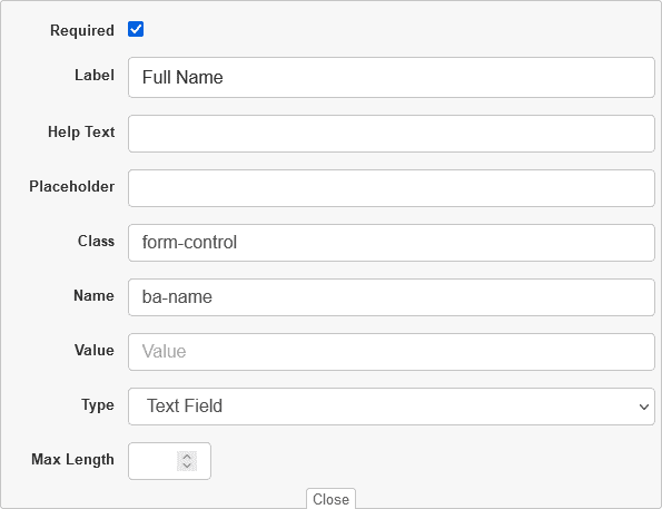
1) Text Field
This Field perfectly accommodate short answer user responses. User Information Fields pre-generated using the field include Full Name, Address, Tel, Zip, Email, Color, Password and Phone fields.
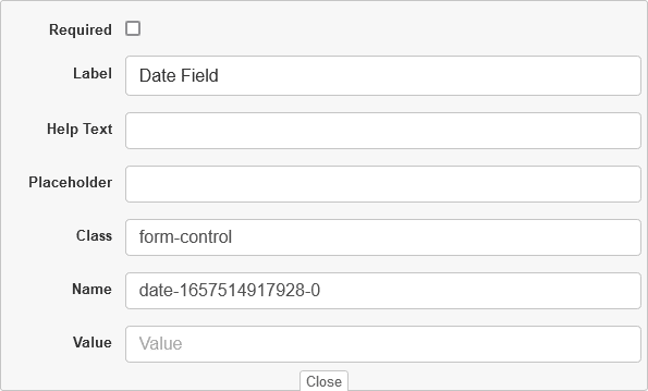
2) Date Field
The element create input fields that let the user enter a date, either with a textbox that validates the input or a special date picker interface. The resulting value includes the year, month, and day, but not the time.
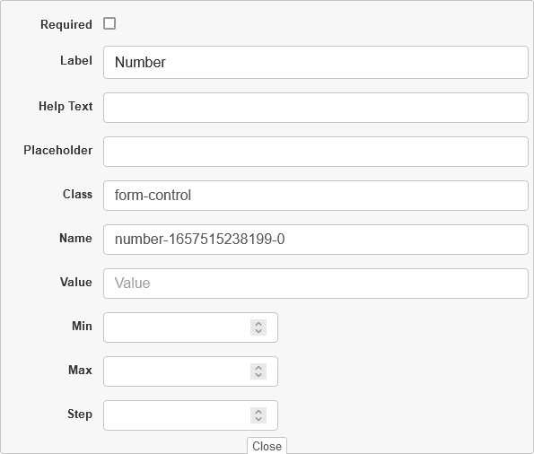
3) Number Field
The number field supports only numeric characters and comes with an up/down arrow for users to scroll through number values in designated steps.
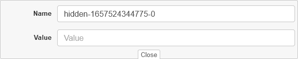
4) Hidden
The Hidden field does not display for users viewing the form. It can only be viewed from the form builder by a logged in administrator. Use this to store information that you want passed into submission data or sent along in an email, but not displayed to the user.
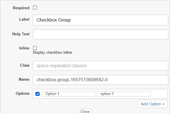
5) Checkbox Group
This element is rendered by default as boxes that are checked (ticked) when activated, like you might see in an official government paper form. The exact appearance depends upon the operating system configuration under which the browser is running. Generally this is a square but it may have rounded corners. A checkbox allows you to select single values for submission in a form (or not).
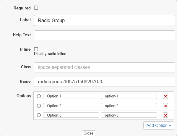
6) Radio Group
The Element is generally used in radio groups—collections of radio buttons describing a set of related options.
Only one radio button in a given group can be selected at the same time. Radio buttons are typically rendered as small circles, which are filled or highlighted when selected.
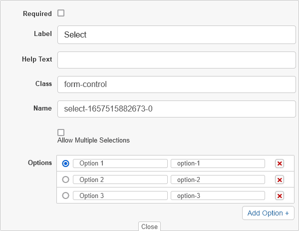
7) Select
The element represents a control that provides a menu of options.
The Select element has some unique attributes you can use to control it, such as multiple to specify whether multiple options can be selected, and size to specify how many options should be shown at once. It also accepts most of the general form input attributes such as required, etc.
8) Text Area
The element represents a multi-line plain-text editing control, useful when you want to allow users to enter a sizeable amount of free-form text, for example a comment on a review or feedback form.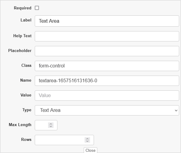
9) Button
The element is an interactive field activated by a user with a mouse, keyboard, finger, voice command, or other assistive technology. Once activated, it then performs a programmable action, such as submitting a form or opening a dialog.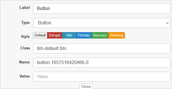
10) Header
The Header element represents introductory content, typically a group of introductory or navigational aids. It represent six levels of section headings. H1 is the highest section level and H6 is the lowest.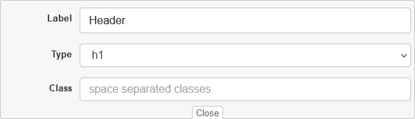
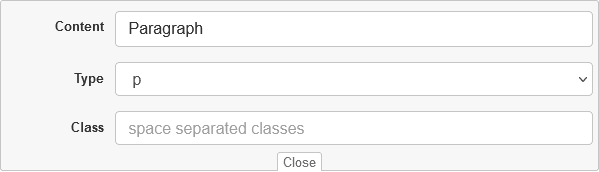
11) Paragraph
Paragraphs are usually represented in visual media as blocks of text separated from adjacent blocks by blank lines or first-line indentation.