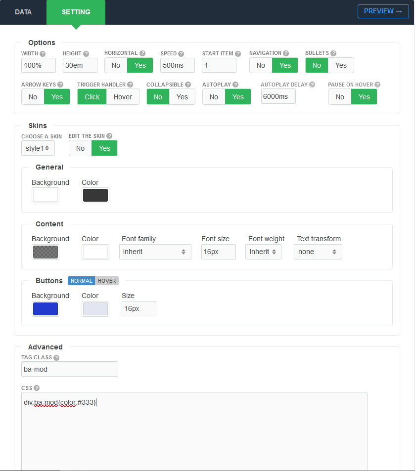
Settings Page
After successful installation of the extension, go to Content > Site Modules and Search for module name. If you don't find it in the modules page then click on the New button in the top left corner of the page and add the Module.

There are a few specific settings that you should use when using the module.
| Parameters | Options | Description |
|---|---|---|
| Width | [String] | Set the width of the module in pixels or percentage. For example you can set 100% or 1200px. |
| Height | [String] | Like the width you can set the height parameter pixels or percentage. In "Horizontal" mode you should set the module height in "Vertical" mode to "auto" |
| Horizontal | Yes || No | You are free to choose to display the module in horizontal or vertical |
| Start item | [Number] |
Choose an number of item index to be opened automatically in the first time |
| Navigation | Yes || No | A feature that’s often requested in slider, is previous/next buttons. Luckily, they’re easy enough to add with select [YES]. |
| Bullets | Yes || No | If true, Bullets(indicator dots) will be appended to the module. |
| Speed | Milliseconds | Specifies the speed of the item effect. Default value is 900 milliseconds |
| AutoPlay | Yes || No | Set to YES if you would like the item to change automatically. |
| AutoPlay Delay | Milliseconds | Amount in milliseconds for the autoplay to change |
| Pause on Mouseover | Yes || No | The typical use case for pausing a autoplay on a hover event is to pause when the mouse is over the module. |
| Arrow keys | Yes || No | If you want to use it, you can add keyboard arrow support. Try it: hit left and right arrow keys. |
| Trigger handler | Click || Hover | The method triggers the specified default behavior of an event like CLICK for the header elements. |
| Choose a skin | 8+ Styles | We provide 26+ Beautiful Styles for you choose. You can also feel free to custom style for your requirements. |
| Custom | Background,Color,Font family,Font size,Font weight,Text transform | Feel free to get creative with the parameters provided to create a great style of your own |
| Tag Class | [String] | The tag class attribute is used to specify a class for the module |
| CSS | [String] | You can add extra CSS into the module parameters easily without modifying any template CSS files. |