Settings Page
After successful installation of the extension, go to Content > Site Modules and Search for module name. If you don't find it in the modules page then click on the New button in the top left corner of the page and add the Module.
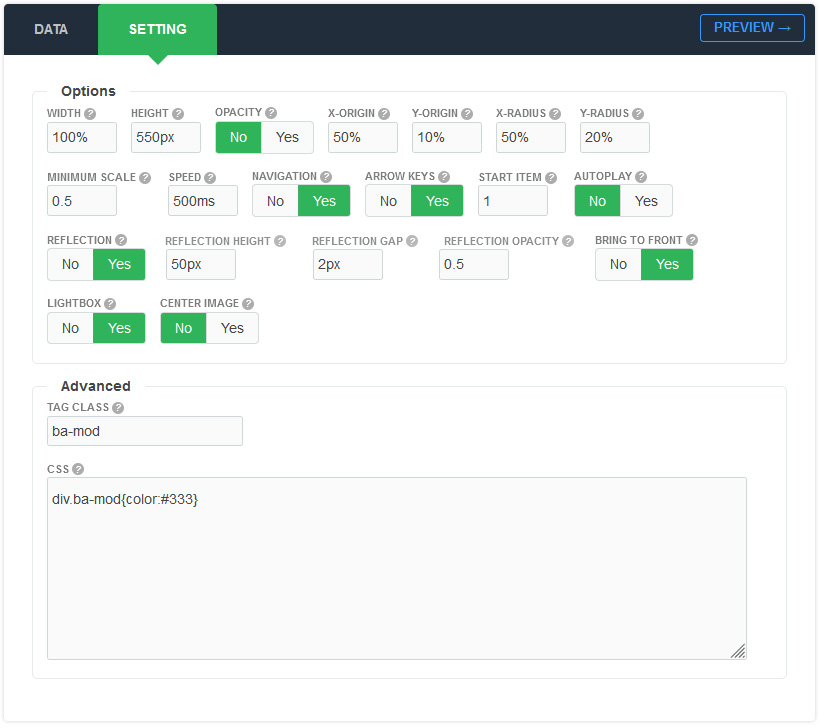
There are a few specific settings that you should use when using the module.
| Parameters | Options | Description |
|---|---|---|
| Width | [String] | Set the width of the module in pixels or percentage. For example you can set 100% or 1200px. |
| Height | [String] | Like the width you can set the height parameter pixels or percentage. In "Horizontal" mode you should set the module height in "Vertical" mode to "auto" |
| Opacity | Yes || No | You can set the opacity for the items. |
| X-Origin | [String] | Horizontal position of the circle centre relative to the container. You would normally set this to half the width of the container. |
| Y-Origin | [String] | Vertical position of the circle centre relative to the container. You would normally set this to around half the height of container. |
| X-Radius | [String] | Half-width of the circle that items travel around. |
| Y-Radius | [String] | Half-height of the circle that items travel around. By playing around with this value, you can alter the amount of tilt. |
| Start item | [Number] |
Choose an number of item index to be opened automatically in the first time |
| Minimum scale | [Number] | The minimum scale applied to the furthest item. The item at the front has a scale of 1. To make items in the distance one quarter of the size, minScale would be 0.25 |
| Speed | Milliseconds | Specifies the speed of the image effect. Default value is 900 milliseconds |
| AutoPlay | Yes || No | Set to YES if you would like the module to change automatically. |
| AutoPlay Delay | Milliseconds | Amount in milliseconds for the autoplay to change |
| Pause on hover | Yes || No | The typical use case for pausing a autoplay on a hover event is to pause when the mouse is over the module. |
| Navigation | Yes || No | A feature that’s often requested in slider, is previous/next buttons. Luckily, they’re easy enough to add with select [YES]. |
| Arrow keys | Yes || No | If you want to use it, you can add keyboard arrow support. Try it: hit left and right arrow keys. |
| Reflection | Yes || No | You can activate the reflection for each item |
| Bring To Front | Yes || No | Clicking an item will rotate it to the front |
| Lightbox | Yes || No | You can enable this feature so that when you click on each image and it will open in a lightbox |
| Center image | Yes || No | You can add an image in the center of the module |
| Tag Class | [String] | The tag class attribute is used to specify a class for the module |
| CSS | [String] | You can add extra CSS into the module parameters easily without modifying any template CSS files. |