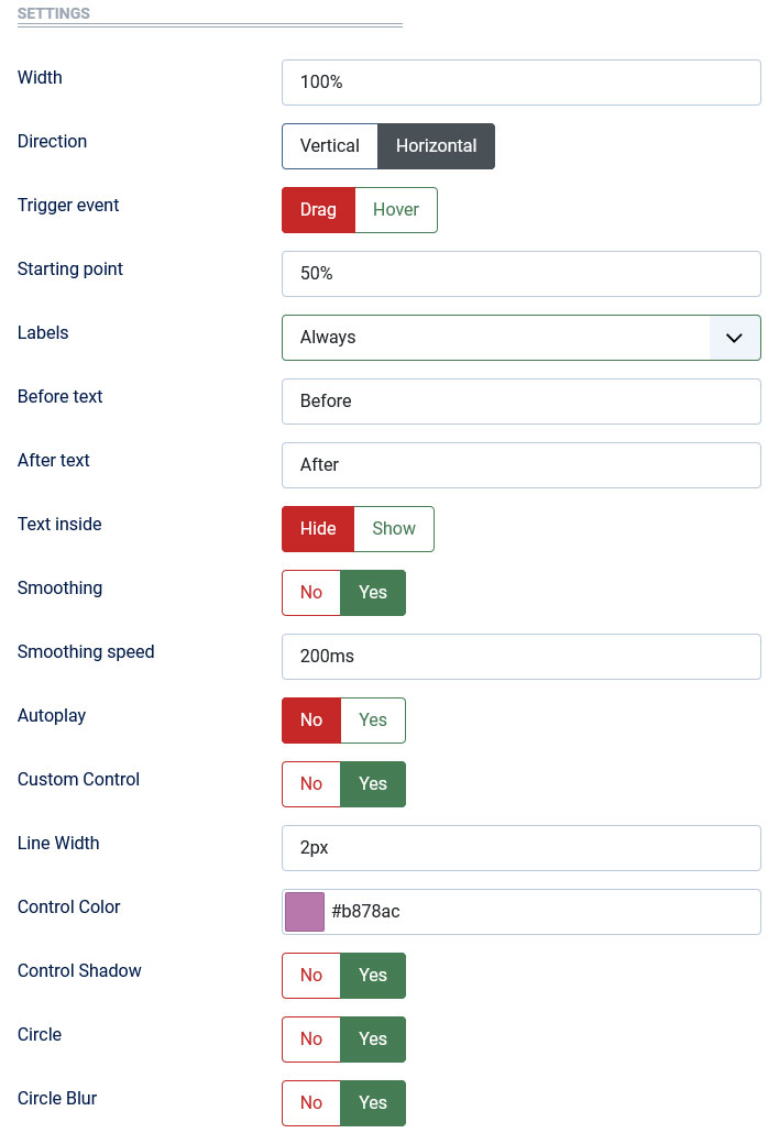
Settings Page
After successful installation of the extension, go to Content > Site Modules and Search for module name. If you don't find it in the modules page then click on the New button in the top left corner of the page and add the Module.

There are a few specific settings that you should use when using the module.
| Parameters | Options | Description |
|---|---|---|
| Width | [String] | Set the width of the module in pixels or percentage. For example you can set 100% or 1200px. |
| Direction | [Vertical | Horizontal] | Select Horizontal or Vertical Orientation |
| Trigger event | [Drag | Hover] | Determine whether to allow the user to compare before/after images with mouse hover/drag. |
| Starting point |
[String] |
You can set a starting point. |
| Labels | [Always | On Hover | Hide] |
You are free to choose show/hide the labels |
| Before text | [String] | Input your text. |
| After text | [String] | Input your text. |
| Text inside | [Yes | No] | You can enable/disable the Text |
| Smoothing | [Yes | No] | Enable/disable the smooth sliding effect after drag/hover the slider. |
| Smoothing speed | Milliseconds | Enter your speed in Milliseconds(ms). |
| Autoplay | [Yes||No] | Enable/disable the autoplay option for the slider. |
| Custom Control | [Yes||No] | Customize the appearance of the slider. |
| Control Color | Color | Change Handle Color using color picker. |
| Circle | [Yes||No] | Enable/disable the Circle to wrap the arrows |
| Tag Class | [String] | The tag class attribute is used to specify a class for the module |
| CSS | [String] | You can add extra CSS into the module parameters easily without modifying any template CSS files. |